
What Google’s Algorithm Change Means to You
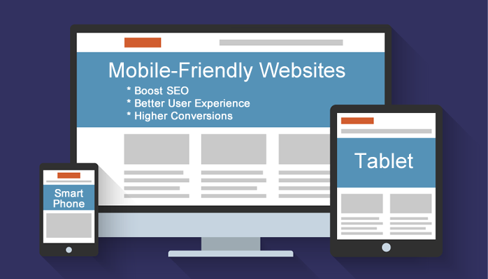
If there’s one thing you really need to focus on as a business owner this year, it’s getting your website optimized for mobile use.
Why? The search engine game has changed – again.
In the past, most online searches used to be performed from desktop computers but now, more and more of your potential clients and customers are searching using their mobile devices.
That means if your website isn’t set up to accommodate their specific needs, then you could very well lose business.
After reading this article, you’ll have a better understanding of how important it is for your website to be optimized for smart phones and what you can do about it if it isn’t.
There are two major reasons why having a mobile/smart phone friendly website is a must:
-
Trends Show Mobile Buying is On the Rise and Growing Fast
All indicators point towards mobile consumers being ready to buy. In fact, Rocket Post states that over half of all mobile searches lead to a purchase.
And even more importantly, according to The Social Media hat, nearly half of consumers say they won’t return to a website if it doesn’t load properly on their mobile devices.
So if your business is not mobile ready, you could lose the lead or sale.
And even if a consumer is not buying, they are using their mobile devices to research your company and learn more about what you have to offer. If they find visiting your website a hassle, can’t navigate around easily and are met with tiny font sizes and squished text, then the odds are extremely good that they will quickly leave and find a better experience on your competitor’s website. -
Google Will Now Favour Mobile-Ready Websites in Search Rankings
Google has recognized the changing behaviour of searches and that’s why they have recently announced a major algorithm update: As of April 21, 2015, Google will be factoring in how mobile-friendly a website is to determine how high in the searches your website will appear.
That means if your website is not mobile friendly, your position in the search results may get pushed down where smart-phone friendly sites will be displayed above yours.
So if you don’t want to lose organic traffic to your website, it’s critical to convert your website to be mobile ready.
Not sure if your website is mobile ready? No problem. Google has provided a free tool to check if your website is mobile friendly: https://www.google.com/webmasters/tools/mobile-friendly/
Choosing the Right Mobile Ready Format for Your Business
Now that you have very compelling reasons to take action and convert your website to be mobile ready, the only question left is to decide on which direction to take.
There are two basic formats that can be used to convert your website to be mobile ready:
-
Constructing a separate mobile site
This involves your web developer designing a completely separate website that is specifically designed to display properly for mobile devices.
In this case when a user visits, your website detects what browser they are viewing it on and serves different HTML code that is suited for that specific browser size.
Some entrepreneurs and business owners opt to just have their home page converted over to being compatible to smart phones so that the user’s initial experience to the site is a favourable one.
The downfall of this approach is that while it may display perfectly on current devices, if a new phone or tablet size comes out, it may require creating a new mobile design sized for that specific browser size.
The other major downfall is content redundancy. When you make an update to your main “desktop version” website, then you also have to remember to update the mobile-friendly versions too.
So this approach can require some attention to upkeep to make sure there is a mobile site designed for every popular browser size. -
Develop a new “Responsive” website.
Having a responsive website means it will shift and adjust its layout according to the size of screen the user is looking at your website from.
So if a user is looking at your website from their desktop, it will look like a normal website layout; however, if they are looking at it from their smart phone or iPad, then the layout will adjust according to the smaller screen size yet still be very readable and user-friendly. What happens is elements on the screen shift into a single column layout as opposed to making everything tiny to read and see.
The advantage of a mobile responsive site is that it will display correctly and be easy to read no matter the browser size. Additionally, there is only one website to maintain.
Plus you don’t have to implement any special search engine optimization measures. The SEO you do on your web page will work perfectly when the website displays on mobile devices as well as on a desktop.
Having a responsive designed website is what Google recommends. So if you have a fixed width, desktop-friendly website right now, this is the time to seriously consider converting it to being mobile responsive.
Depending on how old your current website is and how it was originally built, there is a chance that it can be converted over to being responsive without the need for a complete re-build. You will need to contact your webmaster to find out if this is an option.
Another thought to consider is that if your website is more than 3 years old, it might be looking out of date by now so taking advantage of the need to convert to being responsive can also mean having a fresh design with a more contemporary layout.
With your website representing your business 24 hours a day, the investment is well worth it as opposed to sending potential leads and clients away because they couldn’t navigate your website easily.
Avoid These Mobile Ready Mistakes
As a side note and something to bring to your web master’s attention is that Google warns it will penalize websites that make these mistakes:
- blocked JavaScript, CSS and image files,
- unplayable content,
- faulty redirects,
- mobile-only 404s,
- app download interstitials,
- irrelevant crosslinks or
- slow loading mobile pages.
Working with a qualified web developer who is educated on mobile web design and development can ensure that your website doesn’t have any of these mistakes.
Don’t Delay – The Time to Go Mobile Is Now
While in the past business owners may have put off converting their website to a mobile-ready design, today there are many compelling reasons why it’s critical to convert your website now.
Mobile users are researching and buying from their smart phones at an ever-growing rate. Plus, if you aren’t mobile ready, Google will start penalizing your search rankings.
Take notice and take action: Mobile is here to stay.
Is your website ready? If not, give us a call to discuss which is the best route for you to take in converting your website to being mobile-friendly.
To your business success,
Susan Friesen
P.S. If you liked the article, you might want to subscribe to our newsletter. We publish tons of valuable content to help you learn more about marketing, and subscribing is the best way to ensure you don’t miss out. Additionally, if you’d like to learn more about building a search engine optimized website, click here for our free website guide.

About the Author, Susan Friesen
Located in the lower mainland of B.C., Susan Friesen is a visionary brand strategist, entrepreneur, and founder of British Columbia’s premiere boutique web development and digital marketing agency, eVision Media.
With over 20 years of experience in the industry, she is an expert in helping businesses establish their online presence and create a strong brand identity.
Her passion for empowering entrepreneurs and small business owners to succeed in the digital world has earned her a reputation as a leading authority in the branding and marketing industry.
Visit www.BrandIdentitySteps.com and download your FREE guide: "Unlocking Customer Trust and Business Growth: Your 7-Step Guide to Defining a Compelling Brand Identity that Appeals to Your Perfect Clients".


