How to Rebrand Your Business Like A Boss
There are so many different reasons why a small business owner may decide to rebrand a website: poor conversions and/or sales, confusing navigation or an outdated design, to name a few.
However, as I mentioned in my previous blog The Right Reasons for Rebranding Your Business Logo, it’s essential to have strong reasoning, logic and stats behind rebranding your business.
For example, are poor conversions due to an ineffective design or a glitchy shopping cart?
Is your website truly outdated or are you just bored of the colour scheme?
This guide will help you first understand whether or not you need to reinvent your business, and if you do, how to rebrand your website in the most effective way possible.
I’m going to share a personal example for this article. eVision Media is rebranding our website at the moment. We decided this was a good idea because:
- We’re now also targeting new entrepreneurs coming from the corporate world as well as wanting to appeal to established entrepreneurs who are ready to up-level their business.
- It was time to update how we present our services on our home page. We didn’t feel that we were presenting our benefits clearly enough in some areas.
- Some of the features and functionality of our existing site were breaking down. It was time to upgrade and use newer technology to showcase our offerings.
- We’ve had some confusion around the penguin logo. Some people see a woman’s hair or aren’t quite clear on what it is.
Our first step in the re-branding process was to give our logo an update. Here’s our more clearly defined logo featuring the Emperor Penguin and baby:
In the coming weeks we’ll be revealing our new website and I can’t wait for the big reveal! And before you jump into the redesign process, first determine if this is something that’s truly needed as explained next.
Part 1: Is It Time to Reinvent Your Business?
You’ll have to take a good, hard look at your online presence.
You need to ask yourself the following questions, but it also helps to have outside opinions from clients, focus groups and social media followers—you may not have the most objective opinion.
- Am I targeting a new type of audience/client?
- Is the site well-optimized for mobile? According to Statista, over 52% of web traffic now happens on a mobile device. If your online store is slow or looks terrible on a smartphone, you have a lot to lose. The best way to check if this stat is accurate for you is to check your Google Analytics.
- Have my products or services drastically changed?
- Is my bounce rate high? Google defines bounce rate by how many users leave the page they entered on, without interacting with anything. According to a study by RocketFuel, average bounce rates are between 26% and 70% for most websites.
Now, if your bounce rate is high on a Contact Us page, where a customer simply wants your contact info and leaves, that’s one thing. But if it’s high on pages that you want people to stay on and interact with, it’s time to do a deep dive as to why potential customers aren’t sticking around. - Am I getting complaints about the design or user experience?
- Does the design look outdated? The look and feel of website design can change quickly and often dramatically from one year to the next. Sites that were designed 5 years ago can almost be guaranteed they look out of date now.
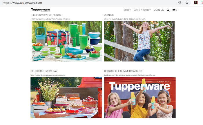
If the name “Tupperware” conjures up images of avocado-coloured plastic and 80s neighbourhood parties, you’re not alone. Tupperware struggled to appeal to a modern audience but have done so by modernizing everything from their logo to their Pinterest-style imagery.
Part 2: The Reinvention
If you’ve decided to embark on the website redesign process, you’re in for an exciting and challenging ride! Here are 9 ways to accomplish your goals in the most user-friendly way possible.
-
Complete a competitive analysis.
This is a crucial step in many marketing and branding processes. You should have done one when you were creating your company.
This time look at how fast your competitors’ website load, or how user friendly their navigation is. By exploring what you’re up against, you can do things better when you’re rebranding your business.
-
Revisit your values and brand positioning.
Before hiring a web designer, I highly recommend revisiting your business values and brand positioning.
Be clear on the impression you want your website visitors to receive the moment they land on your site. How do you want your business to be perceived as? What brand personality do you want to portray? What values do you want to be known for?
By having a clear understanding of these types of branding questions, you will now have a clear brand guide for your web designer to follow.
Here’s a few resources that will help you in this process:- Start with Why: How Great Leaders Inspire Everyone to Take Action by Simon Sinek
- Find Your Why: A Practical Guide for Discovering Purpose for You and Your Team also by Simon Sinek
- Building a StoryBrand: Clarify Your Message So Customers Will Listen by Donald Miller
- Work with me as your business and marketing mentor.
-
Define your goals.
Rebranding your business online isn’t just about the look and feel. You want to improve upon your customer experience.
Let’s say you want to collect more email addresses. You’ll need to decide where to place your eNewsletter signup box or giveaway offer to compel visitors to give you their info.
If your goal is to convert a new type of client, you’ll need to think about the calls-to-action that will resonate best with them.
Whatever your goals are, they should be focused on your customers’ needs, not your own! -
If it ain’t broke, don’t fix it.
We can get so caught up in refreshing and revamping that we go too far. If you’ve received widespread attention and/or accolades for your business logo, why would you change it?
If a certain article in your blog gets a lot of organic traffic, don’t take it down just because you are tired of it or want to focus on a new audience. It’s just as important to know what not to change.
Always have your target audience in mind. What are they finding useful and informative that helps them make a decision on whether to do business with you? It’s not about you and your personal preferences. It’s about them and what they need from you. -
Create a design and content plan.
Depending on your target audience, brand positioning and goals, you may be able to repurpose existing marketing collateral, or you may need to start from scratch.
Go over all of your design and copy elements before the website redesign process so you have an accurate inventory of what you need to create. -
Build a wireframe and mock-up.
A wireframe is a layout that shows what elements will be on a web page. You don’t just start creating menus, slapping on images and putting in links on a live page.
You need to plan and visualize before you rebrand your website, so users have the best experience possible.
A mock-up is also a visual representation that includes design and copy elements, although copy can be demonstrated with a placeholder, as we’ve done here. We’re still working on the messaging in this section, but we wanted to plan out where it would go.
-
Incorporate voice search into your SEO plan.
It’s not enough to focus solely on copy anymore. People want instant solutions when they’re searching for something online.
As you reinvent your business, you should be thinking of ways to optimize your website for voice search in addition to what people are typing into the search box.
Many consumers already use it to find what they’re looking for and according to ComScore, 50% of searches will be performed this way by 2020.
Learn more about voice search here.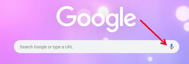
-
Make mobile a top priority.
A big part of the website redesign process is ensuring your website looks great on any device, from desktops to smartphones. Images and font sizes may look perfect on your computer but break or look crowded on a phone screen.
Always optimize and test for mobile devices while you rebrand your website. -
Hire a professional company to help.
Unless you’re a marketing guru, rebranding your business isn’t a DIY project. There are too many important branding, programming and implementation elements at stake.
You should consider hiring a full-service professional web design and development company. Take a look at all of the front- and back-end components we can handle for you here.
The website redesign process is an iterative one. You’re not going to nail it with one version.
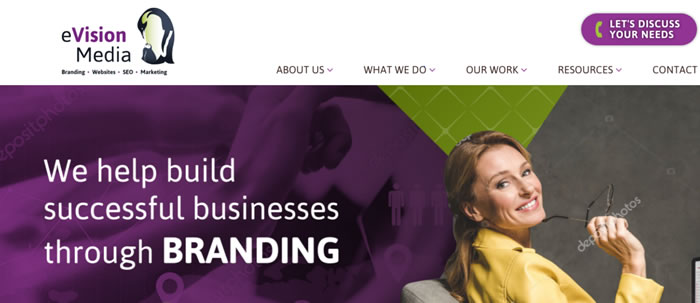
Case in point: This is a recent mock-up version of the eVision Media site. There’s still a lot of work to be done: add SEO optimized copy, shift elements around to provide the ideal user-flow experience and find ideal imagery that best portrays our brand positioning.
However, this gave the team something to provide feedback on, and I’m happy to say that we’re moving right along.
By planning ahead and hiring the right people to get the job done, you’ll end up with a beautiful and functional online presence you’ll be proud to share with the world.
Related resources:
» How to Define Your Brand Identity with 5 Simple Questions
» What Kind of Website Does My Business Need?
To your success,
Susan Friesen
P.S. If you liked what you read (and heard) here, you will want to sign up for our newsletter where you’ll get notified every week of our blog posts, announcements and business-building strategies. Click here to also receive our free website guide: www.UltimateWebsiteGuide.ca

