Thinking About Changing Your Marketing Graphics?
Over time your business will grow and evolve. You may offer new services or products, enter different markets or target another demographic.
If this happens, you might need to consider changing your marketing graphics.
However, you need to be careful you’re not undoing all the hard marketing and branding work that you’ve done and that you fully understand how to rebrand for the most effective results.
Your brand tells a powerful story; you don’t want to dilute that by fixing (or breaking) something that doesn’t need fixing!
Here are a few times when rebranding your business logo is a bad idea:
- You’re tired or bored of the colours, image or font and want something new. You may have built up a lot of brand equity, which refers to the value of having a well-recognized name and reputation.
By not rebranding your business logo for the right reasons, you could dilute all this equity you’ve accumulated. You need to take a look at your ideal customer and data before you make any big decisions.
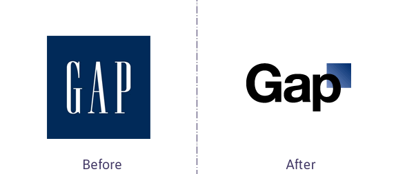
Here’s Gap’s “old” look on the left and a new one they tried to roll out in 2010. The negative feedback was so overwhelming that they soon reverted back to the classic one.
- Customers don’t understand what you do. Before you start working on your graphics to clarify what you offer, take a step back. Is there something unclear in your positioning statement, mission or website copy that’s confusing people?
Sometimes a picture isn’t worth a thousand words—you may need to figure out how to rebrand your written marketing materials rather than your imagery.
So, when should you think about rebranding your business logo?
I’m going to use a really personal example! eVision Media is going through a change. We originally chose the Emperor Penguin after Daniel and I went to see March of the Penguins.
![]() We realized that these majestic creatures were the symbol of qualities eVision Media stands for: Strength, Endurance, Pride, Dependability, Commitment, Loyalty, Togetherness and most importantly, Nurturing.
We realized that these majestic creatures were the symbol of qualities eVision Media stands for: Strength, Endurance, Pride, Dependability, Commitment, Loyalty, Togetherness and most importantly, Nurturing.
eVision Media is built on nurturing our clients into success and being the support system a company needs in this technical day and age. The Emperor Penguin was the perfect symbol to portray these qualities.
So why change it?
We want to appeal to our existing demographic plus a new demographic: people who are leaving the corporate world for the exciting world of entrepreneurship plus micro-businesses who are looking for outside help to achieve their goals.
As we move forward targeting a fresh market, we wanted to showcase our services better and modernize our imagery.
Starting with our logo, we recently posed the question to our Facebook followers: which one do you like best?
We had some interesting responses: those who knew us and what we do tended to gravitate towards the most familiar design (A). Others didn’t see a penguin in some of the designs or saw a woman’s face and hair in others.
While we’re now back at the drawing board so to speak, this was an incredibly valuable exercise. If we had picked the one we liked best and threw it out there, we could have alienated and confused the very people we want to attract.
Once our logo is finalized, we’ll then move on to updating our website and other marketing materials.
Some other reasons why changing your logo and marketing graphics can be a good idea:
- You need to better differentiate yourself from another company—your colour, imagery and/or font is too similar.
- If your look is outdated, it could be turning off clients. I did say that tweaking things up for the sake of change can be a no-no, but if your 1980s colour palette or ancient font type is making you look bad, it’s time to take a long, hard look at your marketing materials.
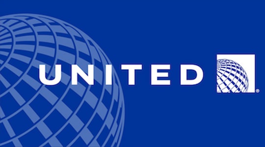
- You’re in the middle of a merger or acquisition and need to balance two companies in one design. When United and Continental Airlines merged, their creative did too: you see the word UNITED with the globe that came from Continental Airlines’ collateral.
- Your organization’s personality has changed. Maybe you were a start-up on a shoestring budget when you began your journey, and now you’ve grown your profits, clients and employees.Investing in your look and feel may be a necessity if you want to stay ahead of the competition.
Related blog: 2019 Graphic Design Trends Embrace Social Change
There are many situations where you should switch up your creative. But you must focus on why you’re doing it or you could be damaging your reputation, brand equity and revenue. The best way to go through the process is to hire a professional marketing company to do it.
From logos to brochures to websites, we can help you successfully rebrand all of your collateral for the right reasons or tell you when it’s not the right plan. Contact us for more information.
To your business success,
Susan Friesen
P.S. If you liked what you read (and heard) here, you will want to sign up for our newsletter where you’ll get notified every week of our blog posts, announcements and business-building strategies. Click here to also receive our free website guide: www.UltimateWebsiteGuide.ca

About the Author, Susan Friesen
Located in the lower mainland of B.C., Susan Friesen is a visionary brand strategist, entrepreneur, and founder of British Columbia’s premiere boutique web development and digital marketing agency, eVision Media.
With over 20 years of experience in the industry, she is an expert in helping businesses establish their online presence and create a strong brand identity.
Her passion for empowering entrepreneurs and small business owners to succeed in the digital world has earned her a reputation as a leading authority in the branding and marketing industry.
Visit www.BrandIdentitySteps.com and download your FREE guide: "Unlocking Customer Trust and Business Growth: Your 7-Step Guide to Defining a Compelling Brand Identity that Appeals to Your Perfect Clients".