A Case Study on Rose Marie Swanson
No matter what kind of business you own, if you want to ensure a successful rebrand, you’ve got to be perceived as trustworthy.
Hopefully, once you’ve gotten to the point of wanting to refresh your brand, you’ll have already built up a considerable amount of trust.
But if you don’t do what you can to preserve what you’ve already built, you could alienate your customers and quickly lose whatever trust you have.
If you’re the owner of a well-established brand, regardless of how trustworthy it might seem, this becomes even more important.
Because when you rebrand, you’re changing something people rely on, something they identify with, and something they’ve come to know and love.
And if you stray too far from that familiar branding, you can confuse your customers, make your brand less recognizable, and run the risk of ruining everything you’ve worked so hard to build.
So, if you want to learn more about what it takes to ensure a successful rebrand, and look at an example of how we were able to do this for one of our clients, then keep reading.
Quite the Balancing Act
When Rose Marie Swanson asked us to completely revamp her brand, it quickly became a delicate balancing act, not least due to the nature of what she does.
Rose Marie is one of our longest-running clients, going all the way back to 2015 when we built her first website.
She’s been well-known in her industry for decades now and had built quite a name for herself well before she ever reached out to us.
Now, before I continue, I should explain what Rose Marie does so you can actually understand her offer.
Rose Marie is what is known as a spiritual coach.
But what is that?
Well, in a nutshell, what Rose Marie does is offer a form of coaching/counselling that deals more with the spiritual, as opposed to other aspects of one’s being.
This could mean helping someone to discover their life’s purpose, learn to deal with trauma from their past, or find out how to stop sabotaging themselves and unlock their full potential.
Basically, if anything is bothering someone on a spiritual level, like how they feel about their life, where it’s headed, who they truly are, or what they really want in life, Rose Marie will work with them to get to the bottom of it and try to help them resolve these issues.
Typically, she does this using non-conventional, and often esoteric methods, which are certainly not promoted in the mainstream, and unfortunately, many people would consider this stuff quackery.
So, before we even started the process of rebranding, her offer was already tough to convey without sounding too woo-woo, and with so many people being skeptical of what she does, it was innately difficult to build up trust in her brand.
That being said, when we rebranded Rose Marie, the last thing we wanted to do was erode that hard-won trust.
Simultaneously, we had to find ways to convey her offer and promote her brand to a new audience, many of whom had probably never heard of her before.
For those of you who are asking how we were able to do all this, below, I’ve detailed every facet of Rose Marie’s new branding, and explained how we worked to maintain trust in all these aspects.
READ: How to Ensure Consumers Trust Your Brand
Whether you’re branding or rebranding, your perceived trustworthiness (or lack thereof) could make or break the success of your business.
But if you don’t make your living in the marketing industry, it can be difficult to know how to inspire trust in your brand.
So, if you want to learn how to make sure your brand exudes trustworthiness, then you’ve got to read this article.
It explains what makes a brand trustworthy, and offers some suggestions for how you can ensure your brand inspires trust.
Brand Identity
For quite some time, Rose Marie had been thinking about changing her brand identity and targeting a new audience, but we didn’t get into serious discussions about it until earlier this year.
In the past, she had mentioned wanting to work with abused women, especially because as a child, she was the victim of severe abuse from several members of her family.
But given how personal this stuff is, and the potential it had to reflect poorly on her family, she hesitated to go through with this rebrand.
Even as we were doing her brand analysis in preparation for the rebrand, she was still questioning if she wanted to actually share this stuff, but I did what I could to push her in this direction, as I felt it was the right decision.
She dealt with extreme trauma as a child, experienced its aftereffects throughout most of her adult life, and wanted to help women heal from the trauma they’d endured from similar experiences, so it only made sense to rebrand in this way.
In the end, she bit the bullet and chose to go through with it.
Right off the bat, we figured the best thing to do was help Rose Marie to establish an emotional connection with potential clients by being open and honest about the abuse she suffered as a child.
We decided not to go into all the gory details, as it might be triggering for some people and end up having a negative effect.
But on her About page, it clearly states, “As a child, I was severely abused by several members of my family,” so as you can see, we didn’t sugarcoat things.
Rose Marie’s rebrand should have inherently inspired trust because she chose to share intensely personal anecdotes about the trauma she’s endured throughout her life, and how this relates to what she does.
In theory, this should show that she can relate to what potential clients are going through, and is dedicated to helping them heal from their trauma.
But unfortunately, some of the more cynical people out there might not see it that way.
So, as you’ll see from the various aspects of her branding detailed below, in addition to being extremely careful about what we said, and the imagery we decided to use, we did our absolute best to preserve her brand, and avoid alienating any of her followers.
Website Design & Development
Even if Rose Marie had decided against this radical rebrand, her website would still have been in dire need of a revamp.
It’s been nearly eight years since we created her first website, and as you can tell, it was definitely starting to show its age.
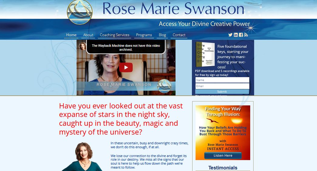
It looked dated and cluttered, the verbiage it was using wasn’t helping Rose Marie’s credibility, and it certainly wasn’t speaking to abused women.
An old, tired-looking website is never a good thing when it comes to trustworthiness, and this alone could end up making people less likely to want to trust Rose Marie.
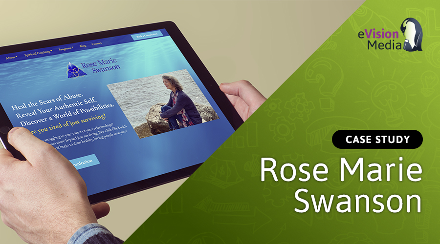
So, we got straight to work on revamping her website, and it definitely looks a heck of a lot better.
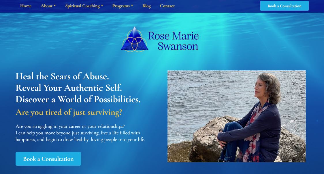
We changed pretty much everything, revising the copy, design, imagery, logo, and even creating a new free giveaway to try to build up her email list with people from her new target audience.
It looks sleek, organized, and modern, and speaks to the pain points of her ideal clients, putting more of a focus on them, instead of Rose Marie.
But despite all these alterations, we made a point of trying not to change too much.
For instance, the navigation is pretty much exactly the same as it was on her previous website, and we simply changed Coaching Services to Spiritual Coaching, as we felt that better explains what she does.
In addition, we still put her name front and centre, ensured her photo was visible above the fold, kept the water theme, and stuck with the blue, white, and gold colours.
This allowed us to ensure that we weren’t eroding the trust and recognition she’d already built, and were able to avoid confusing or alienating anyone.
Lead Generation
Rose Marie’s old website also had a lead generator, as part of her effort to get people to subscribe to her newsletter.
But we decided it was much too general and wasn’t speaking to the abused women who made up Rose Marie’s new target audience.
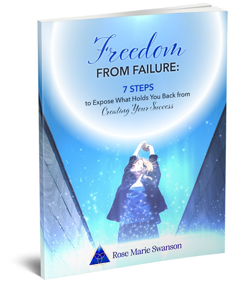
So, to go along with her website redesign, we created a new free giveaway, in the form of an e-book, so she could appeal to this new audience and showcase her expertise.
Truth be told, it actually took quite a while to determine what this e-book would contain.
But after a few brainstorming sessions, we decided to tap into the pain points of her new target audience, create a powerful emotional connection by sharing some anecdotes about the abuse Rose Marie experienced, and offer a simple seven-step process to help them deal with their own issues.
It’s definitely a lot different from her last free giveaway, but we made sure to reflect as much of Rose Marie’s already recognizable visual brand as we could, keeping her old colours, and including her name on the cover, along with her new logo, which is very similar to her old one.
Logo Redesign
As part of the overhaul of her brand, Rose Marie also asked us to update her logo.
However, she was quite fond of the way it looked already, and it was definitely one of the most recognizable aspects of her brand, so we did our best to keep the changes to a minimum.
Below, you’ll see her previous logo on the left, and her new one on the right.

As you can tell, we kept the water theme, the rings, and the triangle, so we didn’t stray too far away from what made her original logo so recognizable.
The triangle and the rings symbolize the holy trinity – a spiritual symbol that’s intimately related to what Rose Marie does.
In addition, images of water tend to be soothing, while the rings represent completeness or wholeness, and all of these aspects exemplify how people are going to feel when they work with Rose Marie.
These elements help to make Rose Marie’s brand stand out, and are all deeply connected to the services she provides, so it wouldn’t have made sense to change any of this stuff anyway.
That being said, even if she had asked us to completely redo her logo from scratch, I may have advised against changing these things for fear of watering down the familiar elements of her brand.
Marketing Collateral
Aside from refreshing Rose Marie’s brand identity, website, lead generator, and logo, we also redid many of the elements of her marketing, as well.
For example, for some of the programs she sells, such as a series of guided meditations, the imagery being used was lackluster, to say the least.
So, we opted to create some new imagery, and it definitely makes a world of difference.
On the left is the old image used for her Gracing to Freedom program, and the new one is on the right.
The old image is literally just a photo of the program’s packaging, and from a design standpoint, it doesn’t align with the rest of her brand.
Whereas the new version offers much more enticing imagery that’s not only better aligned with her brand, but more representative of what people are going to get out of this program.
In addition to this imagery, we also redid all of Rose Marie’s social media banners and the header and footer banners for her newsletter.
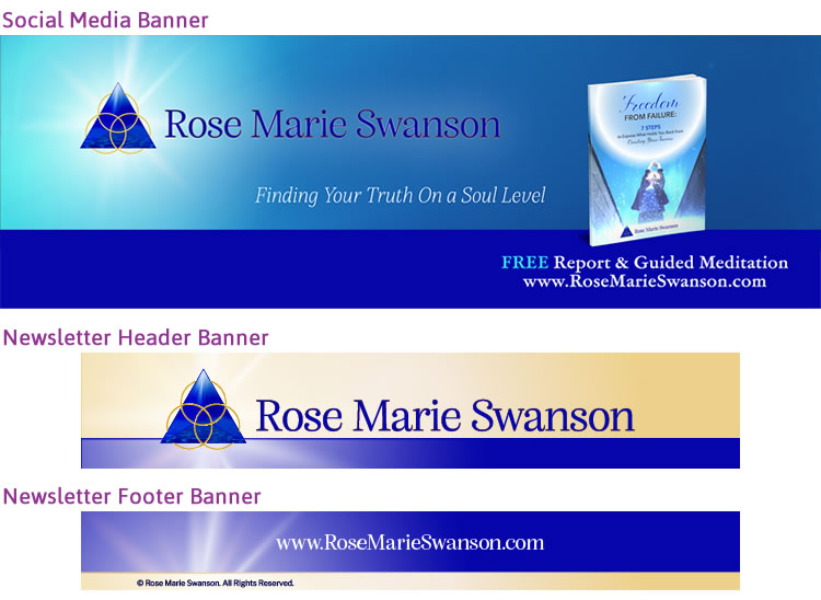
And on top of all this, we even created some printable items for Rose Marie, as well, including her business cards, and a speaker sheet to help her promote herself as a guest on podcasts.
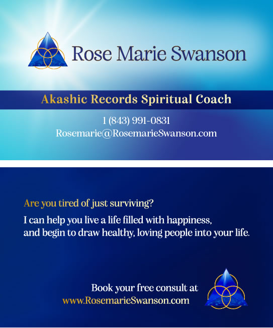
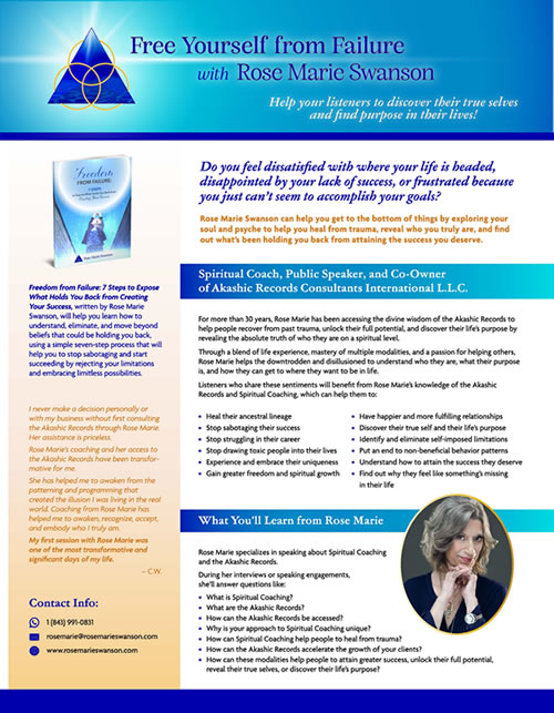
As you can see, all of these different forms of marketing collateral align with Rose Marie’s brand, not least in how they all make use of the blue, white, and gold colours.
And the few elements that didn’t align with her visual brand were updated to ensure that they did.
All things considered, the consistency and comprehensiveness with which we created Rose Marie’s branding and marketing, combined with the preservation of the elements of her brand that were already recognizable, made for an incredibly successful rebrand, and one very happy client.
Are you considering a brand refresh, but you’re not sure if it’s the right decision? We’ve been helping business owners to build their brands for more than 20 years. Contact us today to find out more about how we can help you decide whether a brand refresh is right for your business.
To your business success,
Susan Friesen
P.S. If you liked the article, you might want to subscribe to our newsletter. We publish tons of valuable content to help you learn more about marketing, and subscribing is the best way to ensure you don’t miss out. Additionally, if you’d like to learn more about building a search engine optimized website, click here for our free website guide.
