I’m sure you’ve landed on someone’s website and felt like something was just… wrong; or maybe you were suddenly turned off without even knowing why.
Chances are, you quickly clicked back to find a competitor’s website, where you felt more comfortable and secure.
Your visitors could feel the same way if you don’t pay attention to how you come across to your target audience.
That’s why it’s crucial to identify your brand style before you redesign your website.
In my latest Tea Time Tip: Marketing For Busy Entrepreneurs, I shared some critical factors to ensuring your website redesign is a success so people feel comfortable, excited and engaged when they land on your site. You can watch it here.
In this article, I’m going to share 5 questions you need to answer to determine your business brand identity and create the most effective website possible.
-
What first impression do you want to give?
You have about five seconds to make a first impression. The key findings from a Google study showed that sites with low visual complexity and high prototypicality (how representative a design looks for a certain category of websites) were perceived as highly appealing.
Long story short: keep it simple and clean.
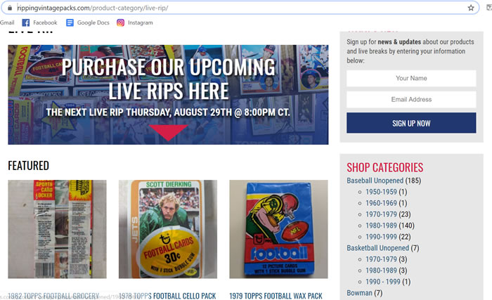
One of our clients wanted us to create a website for their collectible vintage card business. They do live “rips” of unopened vintage sports cards (working with this type of business was a first for us)!
The challenge was to make their website, which features a huge range of sports cards from a number of decades, easy to navigate.
One of our solutions was to break down cards by year in the right-hand navigation, and to highlight featured packs on the home page.
My advice to you: put a lot of thought into how you organize your home page. If visitors land on a cluttered, confusing page, their first impression is going to be one of overwhelm, and off they’ll go to one of your competitors.
-
How are you using colours, images and fonts?
You should be following your brand guide when it comes to choosing design elements for your website.
If you don’t have a business branding guide, it’s time to create one to identify your style and give direction to team members.
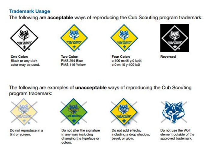
Here’s an example of a detailed branding guide from the Boy Scouts of America. This page shows designers how they can and can’t use the program trademark.
Of course, smaller businesses won’t have as big a brand guide as corporations, but you need something that represents the visual elements of your website, or you’ll end up with a hodge-podge of elements that will confuse your visitors and sabotage your brand awareness.
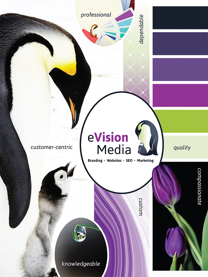
Here’s a snapshot of our recent rebranding efforts that provide an overall feeling of what we want our brand to emanate and the design and style elements we use in all our marketing materials.
-
Are your images high-quality, and delivering purpose and meaning?
Every image you choose for your website tells a story. If you pick poorly-lit photos or tacky stock imagery, you’re giving people the wrong impression. They may see your business as cheap, lazy and unprofessional.
Take the time to make imagery part of your brand identity. Define what you want your images to portray, and what should and shouldn’t appear on your website. Here are some examples I’ve seen in company’s business branding guidelines:- Use softly-lit, neutral imagery that shows young professionals in a creative environment
- Avoid stock photos where people are looking directly at the camera
- Keep product-focused shots to a minimum; every photo should have at least one person in it
Pick the right photos to show off your unique personality and style, whether you hire a photographer or use stock pics.
-
Is your copy telling a compelling story?
The most important thing to remember when you’re writing about your product or service is that it’s about THEM, not you. It’s your opportunity to show and tell customers the benefits of using your product or service.
You can do this with:- A captivating headline. Which article are you more likely to read: one that has the headline “Write Better Blogs” or one that says “10 Surefire Ways to Write Blogs that Make Money?”
- Concise, yet informative and compelling copy. People get overwhelmed if they land on a website that has a novel on the home page.
Identify brand style and then tell your story succinctly and with purpose: what are the benefits your service offers? How can you help your target audience solve their problem?
Break up copy into digestible paragraphs rather than long blocks of text. - Avoid industry jargon. Write in your customers’ language. Avoid acronyms they won’t understand, or overly-technical language that only an expert would grasp.
Also, stay away from over-promising, or fluffy claims (Guaranteed to change your life! Lose 10 pounds overnight). Remember, you only have a few seconds to make a first impression. - Choose your CTAs wisely. Your CTA (call to action) is what your content is guiding your customers towards. It’s the action you want them to take. By using something like “Click here,” you’re not showing your visitors what they’ll get.
Use “Reserve your spot now” or “Start your journey today” or whatever it is that will resonate with your target audience.
-
How easy is it for people to connect with you?
Your contact page should be clearly visible in your top navigation bar, and if you have a physical location, you should embed a map on it along with directions to make it as easy as possible for people to find you.
Take a look at eVision Media’s contact us navigation. We feature it prominently in the top menu bar on every page of our site, plus we give another option right above, which enables our clients to call us for fast, professional service.
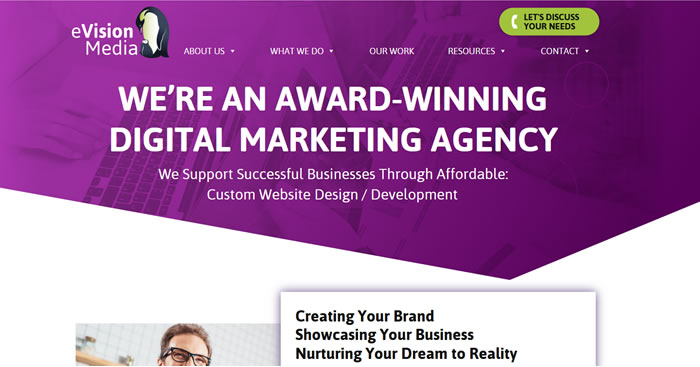
Your social media icons should also be front and centre so that people can connect with you on Facebook, Twitter, LinkedIn, YouTube, Instagram, Pinterest… whichever ones are relevant to you.
The more followers you gain, the more opportunities you’ll have to engage your audience and drive leads and sales. Here are some tips on social media selling.
READ: A Comprehensive 2019 Guide to the
Website Redesign Process

There are so many different reasons why a small business owner may decide to rebrand a website: poor conversions and/or sales, confusing navigation or an outdated design, to name a few.
However, it’s essential to have strong reasoning, logic and stats behind rebranding your business. This guide will help you first understand whether or not you need to reinvent your business, and if you do, how to rebrand your website in the most effective way possible.
The better you understand the importance of brand messaging, the more effective your website redesign—and your business—will be. Ask yourself these important questions and seek the help of a professional website design company to launch the most compelling, engaging and successful website possible! You and your customers will be glad you did.
To your business success,
Susan Friesen
P.S. If you liked the article, you might want to subscribe to our newsletter. We publish tons of valuable content to help you learn more about marketing, and subscribing is the best way to ensure you don’t miss out. Additionally, if you’d like to learn more about building a search engine optimized website, click here for our free website guide.


