Standing Out from the Crowd: A Case Study on TalkOnline Counselling
When you’re a business owner, one of the biggest problems you’ll face is figuring out how to differentiate your business from the competition.
It might not sound that tough, but the truth is, no matter what level of competition you’re dealing with, making a name for your business and building awareness of your brand can be incredibly difficult.
And for businesses operating in oversaturated industries, it can feel like an impossible task.
If you’re trying to figure all this stuff out for yourself, you’ve probably got a million and one questions beating on the back of your skull, a shortage of answers, and a boatload of worries that just won’t seem to go away.
But at the end of the day, there’s really no reason to worry, so long as you understand how to properly position your brand.
Because if you’ve got the right brand positioning, you can build familiarity, gain trust, and fully differentiate yourself from your competitors, even in an oversaturated industry.
So, if you’re wondering how to differentiate your business, and you’d like to see an example of how we’ve helped one of our clients to do just that, then keep reading.
A Bit of a Dilemma
Late last year, registered clinical counsellor, Josipa Katinic, asked us to do a complete rebrand of her business – an online therapy service called TalkOnline Counselling.
When Josipa came to us, she was dealing with two very disruptive issues: 1) She had too many clients on her plate and didn’t want any more, and 2) The counsellors she’d hired weren’t getting enough clients.
The idea was for Josipa to eventually have her employees take on all of TalkOnline Counselling’s clients, so she can focus on getting her PhD.
This made me think about brand positioning in quite a unique way.
I mean, typically, brand positioning refers to how you’re positioning your brand in relation to competitors in your industry, but I never considered that it could also involve the way each member of an organization is positioned within the brand itself.
Not sure what I mean? Let me give you a bit of background.
Initially, Josipa attempted to fix this issue by simply raising her price, as she felt it would deter people from coming to her, and help persuade them to work with one of her employees instead.
But this change actually ended up having the opposite effect, as it positioned Josipa as the best therapist TalkOnline has to offer. So we had to come up with some other ideas to properly position Josipa within her brand.
We did this by first ensuring each counsellor has a highly in-depth bio listing all their specialties, modalities, and certifications, just like Josipa’s, which was considerably lengthier than those of her employees and positioned her as someone with much more experience.
Then we also added a note to her bio, and on her booking service, making it clear she’s not available to take on any new clients.
As a result, Josipa and the counsellors on her team are now much better positioned within her brand, as the playing field between her and the other counsellors has been leveled.
So, now that we’ve discussed how we helped Josipa to properly position the various members of her organization, let’s talk about how we’ve positioned TalkOnline Counselling in relation to its competitors.
READ: How to Determine Your Unique Brand Positioning

Understanding the relationship between differentiation and brand positioning is all well and good.
But if you’re not sure how you want to position your brand, then you’re still going to have to go back to the drawing board.
So, if you’re wondering how to differentiate your business, and you want to learn more about how to determine your unique brand positioning, then this video is for you.
It dives deep into brand positioning, giving you what you need to know to do brand and competitor analyses, identify what makes your brand unique, and more.
Logo
We first examined her logo. Not only did the name need to be changed, but the overall design needed a fresh, new look to better reflect her brand positioning.

The old logo was made up of elements that did not accurately depict the professional brand image Josipa was after, and most importantly, it did nothing to represent TalkOnline’s brand values.
Josipa was also not a fan of her old website’s colour scheme that was based on her logo colours, saying that the white, black, peach, and dark mauve looked too “girly and cheap”.
So, as part of a rebranding process, we went through a brand analysis with Jospia to gain a clear understanding of how her brand positioning should be so that it not only resonated with her target audience, but also garnered the valuable trust needed to appeal to them.
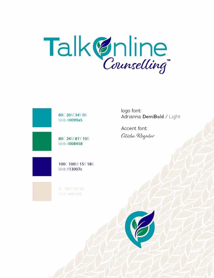
Once the analysis was complete, we designed a new visual brand and logo with more appealing colours, fonts, and design elements, as you can see from the style guide below.

Gone are the irrelevant colours from Josipa’s old website, now swapped out for beige, teal, green, and dark blue, which give off more of a safe, peaceful, welcoming vibe.
This colour palette, along with the addition of the leaves in the logo and design elements, is much more aligned with TalkOnline’s brand values, which include things like safety, support, trust, peace, nurturing, and understanding.
At the same time, they’re also more representative of Josipa’s mission, which is to help clients become self-led by embracing their experiences and making peace with them, so they’re better equipped to create the life they want.
Website
Aside from logo design, one of the most critical considerations for any counsellor is how to make their website stand out from the crowd in what is, for the most part, an oversaturated industry.
So, as we designed and developed her site, we made sure to do as much as we could to position Josipa’s brand as the go-to online counselling service in British Columbia.
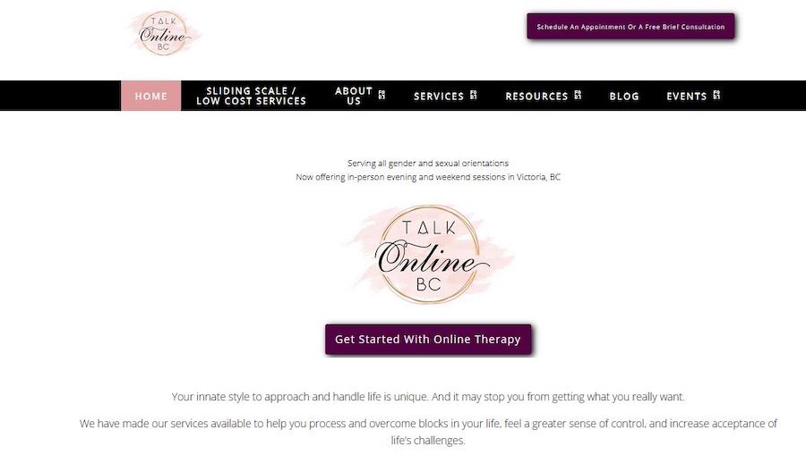
Let’s first compare Josipa’s old website to her new one. Here is a snapshot of her previous website:

The design was very dated, and the overall vibe of the website didn’t feel like something that exemplified TalkOnline‘s brand values. There was nothing telling the first-time visitor why they should hire this company to help solve their problems.
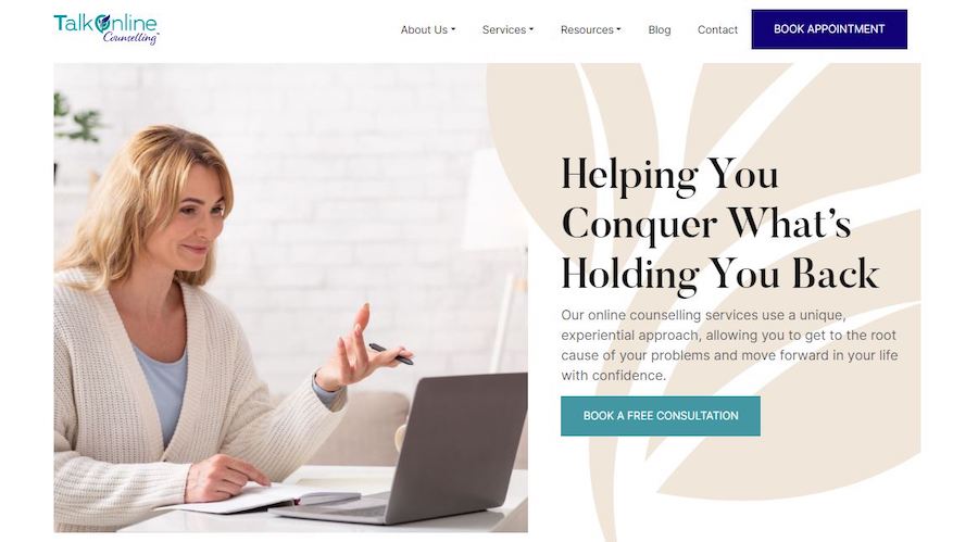
We went to work and designed a unique website layout that better reflects her brand values, and works to build trust with potential clients. We did this by adding, among other things, unique, flowing design elements, inviting copy, relevant imagery, and an entirely new colour palette, as you can see below.

This kind of website redesign is crucial for differentiating any brand, as those who have professionally designed websites tend to look more trustworthy, and passionate about what they do, so already, Josipa is making a better first impression on potential clients than many of her competitors.
We also added several elements to the website as a way to differentiate TalkOnline even further, with our main goal being to build trust with potential clients.
For example, in order to position TalkOnline as B.C.’s go-to online counselling service, we made a point of including a computer in practically every image we used on the website, so users know right away, before they’ve even read any of the copy, that the primary focus of this website is online counselling.
Aside from the imagery, all of the copy was changed to better reflect the benefits potential clients will get from the services Josipa and her team provides, and remind them that TalkOnline is their best option.
Similar alterations were made throughout the website, both in terms of the imagery and the copy, letting potential clients know that this company understands them by focusing on the struggles they’re dealing with, and the benefits they’re going to receive from the services it offers.
These changes, coupled with the fact that the website no longer has the amateurish look it once had, let users know that they’re in the right place, and position TalkOnline Counselling as the absolute best option for online counselling in British Columbia.
Content Marketing
Before working with us, Josipa had never sent out a newsletter.
She had several articles on her blog, and many of them were quite good, but she wasn’t trying to build up an email list or gain any subscribers.
But considering how effective content marketing can be for differentiating a brand, we convinced Josipa to work with us to create a monthly article and newsletter for her subscribers.
And as you can see below, her first article does a great job of differentiating her brand from the competition by detailing what’s different about TalkOnline’s approach to anxiety and depression and confidently claiming that “Our Approach Is Better”.

And aside from how we’ve differentiated Josipa’s brand with the words we’ve used in her blog and newsletter, we’ve also done it by choosing imagery that’s fully aligned with her brand.
For instance, the image we used for the blog above exemplifies Josipa’s brand beautifully, from the caring expression on the woman’s face, to the plants in the background, and even the colour palette.
As you can see from the banner below, we also created branded imagery for her newsletter, which helps to tie everything together and is also fully aligned with her brand, from the colours to the laptop to the leaf, and even the heading from her website.

Initially, the problem we had with Josipa’s content marketing is that she didn’t have any existing newsletter subscribers. Thus, we had to start from scratch, gradually building up subscribers through the use of search engine marketing tactics like running ads on Google.
Slowly but surely, we started to build a following on a limited budget, with 18 people signing up in the first month. For TalkOnline’s first newsletter, the open rate was 68 per cent, meaning 13 of 19 subscribers actually opened the email.
Moreover, the newsletter also had a click rate of 68 per cent, which means that every single person who opened the email ended up clicking on one of the links. These rates are unheard of, especially for a brand that has almost no following.
And now, after two months, Josipa’s subscriber count has more than doubled, from 18 to 40 subscribers.
Social Media Marketing
Social media was something else that TalkOnline Counselling was sorely lacking, so Josipa asked us to do her social media marketing.
This involved several steps, including adding social media icons to her website and social media sharing buttons to her blogs, along with creating a content calendar, setting up a Publer account for scheduling, preparing monthly analyses of her social media stats, and as you can see from the banner below, creating social media headers, with branded imagery to achieve a uniform look across all platforms.

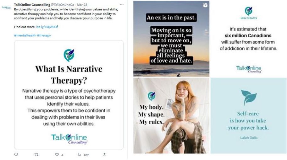
In addition, we also create and publish social media posts for Josipa several times a week, which also works to differentiate TalkOnline and build trust with potential clients, in and of itself, as it’s never a good look to have social media accounts that are devoid of recent posts.
But as you can see from the sampling below, the posts themselves also do a great job of working toward these goals, as they highlight TalkOnline’s specialties, show that they understand the needs, desires, and problems of those looking for counselling services, and offer poignant advice to potential clients.

It’s too soon to talk statistics just yet, as these accounts are barely two months old, but they’re slowly gaining traction, and it’ll be exciting to see how Josipa’s social media presence grows as time goes on.
Are you still trying to figure out how to differentiate your business? Contact us today to find out more about what we can do for you.
To your business success,
Susan Friesen
P.S. If you liked the article, you might want to subscribe to our newsletter. We publish tons of valuable content to help you learn more about marketing, and subscribing is the best way to ensure you don’t miss out. Additionally, if you’d like to learn more about building a search engine optimized website, click here for our free website guide.


