A well-designed landing page is one of the most effective tools for generating qualified leads and driving the growth of your business.
But you can’t just slap something together without putting any thought into it.
And no matter what the purpose of the page is, if you want people who visit it to actually convert, you’ve got to follow landing page best practices.
Because even if you’ve poured your heart and soul into the page, seemingly insignificant design flaws, confusing content, or other issues could be causing users to click away.
From your layout to your copy to how fast your page loads, when it comes to landing page optimization, even the smallest details can affect how your page performs.
But if you follow proven landing page best practices, you can build a page that will engage visitors, clearly communicate your offer, and encourage them to take the next step – whether that’s filling out a form, booking a consultation, or downloading a resource.
With that in mind, this article, which is our third and final installment in our ongoing series on email marketing, offers several tips to help you ensure your landing page is as effective as possible.
Truth be told, landing pages can be used for a lot more than just email marketing, but for the purposes of this article, we’re going to focus on that aspect of them.
So, if you’re working on building your mailing list, you want to optimize a landing page for lead generation, or you’re just wondering what makes a great landing page, keep reading to learn more.
Our Top 9 Landing Page Best Practices
Creating a landing page that can actually convince users to take the kind of action you want them to take is a lot easier said than done.
But with a little testing and fine-tuning, you can create landing pages that deliver a steady stream of valuable, qualified leads – and ultimately, loyal customers.
With that in mind, below we’ve offered our top nine tips on landing page best practices, so you can make the best possible impression on those who visit your page.
1) Ensure Consistent Branding
No matter how you’re getting people to your page, one of the most critical aspects of landing page design is continuity between what’s on the page and the rest of your branding.
For instance, if someone clicks on an ad with your branding on it, and then they end up on a page that doesn’t reflect that brand positioning, it’s never a good look, and it’s something that can quickly and irreversibly erode trust.
A visitor should feel like they’ve landed in the right place immediately, and if there’s any sort of confusion, they’re going to click away and probably never come back.
And if your integrity comes into question as soon as a user lands on your page, there’s pretty much no chance of them giving you their information.
So, whatever you do, make sure that what’s on your landing page is aligned with the rest of your brand positioning, otherwise, it’s going to make you look unprofessional and unreliable.
2) Keep it Focused on One Objective
Hands down, one of the best ways to deter people from your page is by convoluting your offer.
But no matter what the purpose of your page is, it should focus on one thing and remain as concise as possible.
So, make sure to avoid overwhelming visitors with multiple offers or conflicting calls to action.
For example, if your offer is a free eBook, then your landing page should focus only on explaining the benefits of the book and encouraging visitors to give you a name and email address in exchange for downloading it.
You should also do what you can to remove any distractions from the page, including unnecessary links, navigation bars, social media buttons, or unrelated offers that can divert people’s attention and lower conversion rates.
In any case, the key is simplicity, so you’ve got to make it as easy as possible for visitors to understand what you want them to do next.
3) Create an Auto-Responder Email Series
The term auto-responder email series refers to a sequence of automated emails sent to visitors at predetermined intervals after they engage with your landing page.
An effective auto-responder series is an integral aspect of any successful landing page, as it helps to nurture new leads, keeps them engaged, and guides them toward further actions, which can improve the overall performance of your page.
When someone shows interest in your offer by doing something like filling out a form, an initial email will be sent to them confirming their action, thanking them for their interest, and reinforcing the value they received.
After this, timely follow-ups help you to keep your business top-of-mind for new leads, share insights and expertise, and guide them toward the next action you’d like them to take.
This kind of content is invaluable, as it prevents people from forgetting about your business, nurtures the relationship you have with them, and encourages leads to explore other offerings.
4) Use Social Proof to Build Trust
Adding social proof like testimonials, case studies, or trust badges can significantly improve your landing page’s performance.
Because when potential customers see that others have benefited from your product or service, they are more likely to trust your brand and take action.
You may also want to display other trust indicators on the page, like partner logos, security badges, or positive user reviews.
But if you are going to include testimonials, try to keep them as short as possible so that people will actually read them, and make sure to place them near your calls to action so they’re easily visible.
Read: 11 Tips to Boost Website Traffic for New Business Owners
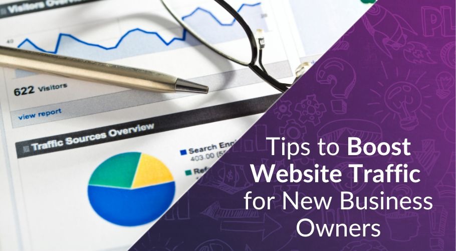
If you want to get the most out of your landing page, you’ve got to not just build it, but also find out how to bring a steady stream of qualified traffic to it.
Because at the end of the day, no matter how beautiful or functional your landing page is, if people aren’t visiting it, it’s not going to matter.
With that in mind, this article offers 11 tips on how to boost website traffic for new business owners, including optimizing SEO, leveraging social media, creating high-quality content, and more.
5) Incorporate Visuals
Visual elements like images, icons, and videos will make your landing page more engaging and help communicate your message more quickly than you could through text alone.
But the visuals you use should make sense in relation to your offer, enhance the user’s understanding of it, and align with your brand positioning.
One of the ways to use visuals strategically is to guide the visitor’s eye toward your calls to action, using arrows, images, or contrasting colours to draw people’s attention.
Having said that, while high-quality visuals are important, make sure that they’re optimized to be the smallest possible file sizes, otherwise, your page may end up taking too long to load.
And if your landing page takes more than a few seconds to load, visitors are likely to abandon it.
6) Write Clear, Concise, and Benefit-Focused Copy
Regardless of what you’re offering, your landing page copy must be as clear and concise as possible, your tone should be conversational and persuasive, and it should focus almost solely on how visitors will benefit from your offer.
That being said, you should avoid long, dense paragraphs that will overwhelm readers, and instead, try to break up the text with relevant headings, use bullet points when you can, and write concise sentences to get your point across quickly and clearly.
And rather than simply listing the features of your offer, make sure to highlight how it will solve people’s problems or help them meet a need.
For example, instead of saying, “Our eBook has 20 pages of expert advice,” it would be much more effective to say, “Learn how to double your sales with actionable tips from industry experts.”
7) Simplify Forms to Encourage Conversions
When it comes to landing page best practices, this is something that often gets overlooked.
You may want to collect as much data as you possibly can, but you have to remember that filling out forms takes time, and if a form looks too time-consuming, people aren’t going to fill it out.
In the context of building an email list, all you really need from people are their email address and first name, and asking for anything more than that is going to discourage them from completing your forms.
8) Use Strong and Clear Calls to Action
Calls to action – especially call-to-action buttons – are arguably the most critical part of your landing page.
These buttons are meant to explain to users what you’re asking them to do, and ideally, also let them know what’s in it for them.
With that in mind, instead of using generic calls to action like “Submit” or “Learn More,” it’s much more effective to use specific, benefit-driven language like “Download My Free Guide” or “Claim Your Discount.”
You also want to ensure that the buttons stand out visually, so make sure to use colours that contrast with the rest of the page, making the buttons impossible to miss.
In addition, you should place a button as close to the top of the page as possible, so users don’t have to search for it, and you can also place multiple buttons on the page, if it’s long enough to warrant it.
9) Make Your Landing Page Mobile-Friendly
Your landing page should look its best no matter what kind of screen it’s being viewed on.
But the reality is most people who visit your landing page will be doing so from some sort of mobile device, so it’s absolutely essential that your landing page looks great and functions properly on these smaller screen sizes.
For instance, you’ve got to ensure that your call-to-action buttons are large enough for people to click on mobile screens.
In any case, you should make sure to use a responsive design, which will allow your layout to adapt seamlessly to different devices.
And don’t forget to test your landing page on various devices and browsers to ensure everything works as expected, from loading speed to form submission.
Do you need someone to help you build a landing page? Why not set up a free 30-minute consultation with me to find out how we can help?
To your business success,
Susan Friesen
P.S. If you liked the article, you might want to subscribe to our newsletter. We publish tons of valuable content to help you learn more about marketing, and subscribing is the best way to ensure you don’t miss out. Additionally, if you’d like to learn more about building a search engine optimized website, click here for our free website guide.
